How to Create & Use UI Tooltips (+Examples)
- Published: August 12, 2022
- Updated: March 22, 2024

Even for well-designed user experiences, there are occasions when users need a little extra nudge or context to direct their attention.
This could be new users who log into an application and need a nudge to take a next step or driving awareness of a new feature or UI change.
Your product needs a comprehensive new user onboarding flow and product tour to guide customers and end-users through your app’s critical features and workflows, educate your users, and drive product adoption.
However, one-time tutorials aren’t enough. To retain knowledge, your users must receive real-time guidance and in-app learning inside your product’s interface, or you’ll risk losing these customers.
You need to provide contextual, in-app guidance and support to supplement your UX/UI and nudge end users. You need to create tooltips.
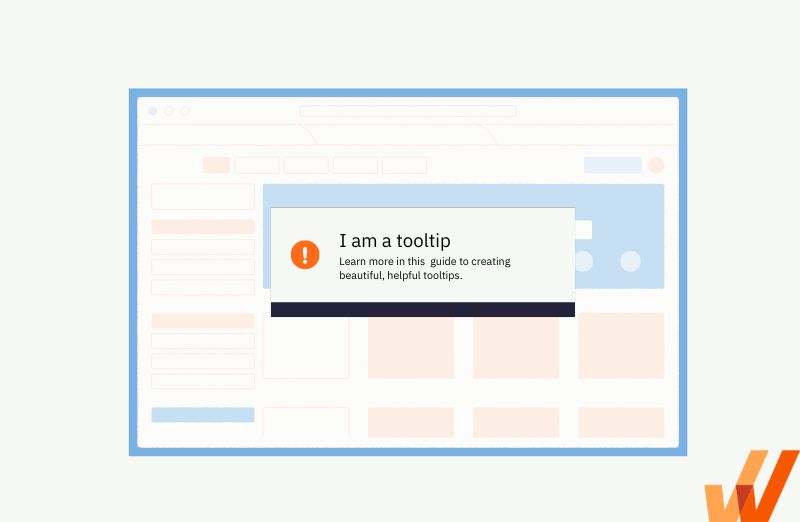
This is an example of a tooltip!
The problem is — tooltips can be terrible if not done correctly. This raises a range of questions:
- What differentiates a good tooltip from a bad one?
- When do you need tooltips?
- How do you create tooltips that improve UX, not kill it?
In this guide, we’re answering these questions to help you create helpful tooltips your users will love.
What Is a Tooltip?
A tooltip is a UI element and type of in-app messaging that overlays on a screen when a user interacts with a specific element on a page or app. They can be triggered by a mouse hover, login, or any other activity within a product interface.
Tooltips provide information about specific features or add context to a process but don’t explain the entire workflow.
Good vs Bad Tooltips
Understanding the differences between an effective and a lousy tooltip is key to capturing their UX benefits. Helpful tooltips are straightforward, short, and distinct. And most importantly, they’re used only where they add value. Redundancy is the biggest enemy of your product UX.
Here are some general rules to remember when creating tooltips:
| Good tooltips | Bad tooltips |
| Is brief and concise. | Is redundant. |
| Add context to a feature or process. | Provides critical information. |
| Compact and well placed within your product. | Covers essential UI elements or parts of the user flow. |
| Stays on the screen until a user moves the cursor or closes the tooltip. | Disappears while a user is reading the tooltip. |
| Present only where additional context is needed. | Is present in many places within your app or product. |
When to Use Tooltips
You don’t need to implement tooltips for every UX scenario in your app. If you find yourself adding too many tooltips, you should address your product usability instead of adding more tooltips.
Below are six tooltip use cases that help provide additional context to users:
1. User onboarding
New users require assistance and guidance more than anyone else, and tooltips can help. When they log in for the first time, they’ll seek guidance on how to learn the product’s UX and understand its value. Using tooltips as a part of a product tour is the least disruptive way to walk new users through the product functionality and answer questions.
You should create specific tooltips that are only visible to new customers. This provides helpful information without giving redundant details to experienced users. You should also create a progress bar for your tooltips indicating their progress through onboarding.
2. New feature announcements
The average open rate of email campaigns across industries is 21%. This is how people will know about your new feature release. For the other 79%, new functionality in your product interface will be a surprise. You should look to use tooltips to inform users of new features and other important updates.
It’s an excellent alternative to pop-up windows and other feature discovery strategies that might hurt user experience, especially if you release new features too often.
3. Process walkthroughs
If you want to guide users through a specific action, tooltips are handy. You can set up action-driven tooltips that will advance as a user proceeds to another step in a process. This type of tooltip is excellent when users must perform a complex process for the first time.
4. Added context
Some features may require additional context before users can master them.
Even if you have a product walkthrough to welcome new users, it won’t replace contextual tooltips. Nearly 80% of users skip product tours that include more than five steps, meaning you don’t have a chance to explain every feature in your walkthrough.
As users navigate your product, they’ll start wondering what specific features are capable of — this is where they’ll want to turn to contextual tooltips.
Consider your product’s core features – are their benefits obvious? Do they use industry-specific terminology that may confuse some users?
You can use tooltips to provide additional context insider your product’s UI to help answer these questions.
5. Field validation
Whenever your users need to fill in a form, field validation tooltips will facilitate this process. These hints are displayed before or after a user fills in a field in the form.
They help to validate user input by triggering a message that provides real-time feedback on the data entered in the field. If the data follows the wrong format and the validation fails, the message will include recommendations on creating a compliant input.
6. Warnings and errors
Similar to field validation tooltips, these are notifications displayed when something doesn’t go as planned. For instance, if a user has to validate their website to get started with your product features and hasn’t done it yet, you may block actions within the app and display tooltips with warnings.
Ways to Create Interactive Tooltips
There are three ways to create tooltips for your product. Two of them require coding skills, and one of them is a no-code method.
1. Use Javascript, CSS, and HTML for custom-built classic tooltips
Those who need the freedom to create and customize classic, non-interactive tooltips should consider building them from scratch with a simple programming language such as Bootstrap, Javascript, or HTML/CSS. While Bootstrap and Javascript are more complex approaches, CSS and HTML offer paths that are relatively easy to follow by someone tech-savvy.
The method is effective for tech teams seeking endless customization opportunities with classic tooltips.
If this is the option your product team is choosing, we recommend utilizing one of the following frameworks to create classic tooltips:
- Bootstrap
- jQuery
- JavaScript
- HTML/CSS
2. Open-source frameworks to create custom interactive tooltips
With an open-source framework like Boostrap, developers can create custom interactive tooltips for your app using simple documentation and open-source tools. This method requires technical knowledge and presents a (potentially fun) challenge to developers.
The following open-source frameworks are the best options for creating custom interactive product tooltips:
But if you’re looking for a completely no-code solution, we suggest a no-code user onboarding tool or digital adoption platform.
3. No-code digital adoption platforms
A digital adoption platform (DAP) is a no-code platform that empowers product managers to create tooltips and other in-app guidance such as interactive walkthroughs, product tours, task lists, and more. This is a fantastic solution for product managers who want to take control of their in-app notifications and product experience, as DAPs also capture user behavior that allows them to make data-backed user flow and product experience decisions.
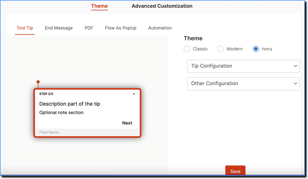
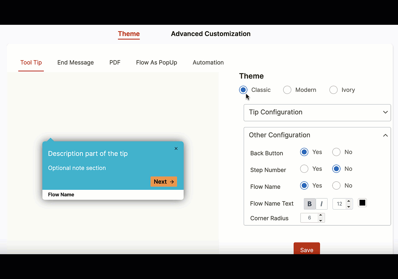
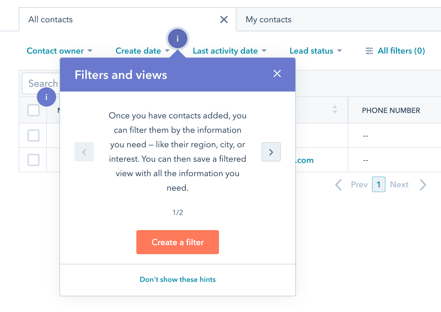
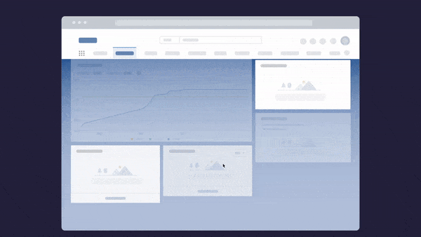
Above: Designing tooltips with Whatfix’s no-code editor.
With a DAP like Whatfix, creating custom interactive, branded, in-app guidance, support, and tooltips is simple. You create tooltips in the no-code Whatfix Editor that allows you to click-and-drop tooltips in your application – and then use its advanced customization feature to brand the element to your product’s theme. With a DAP, create in-app walkthroughs, product tours, user onboarding checklists, beacons, smart tips, pop-ups, field validations, self-help wikis, and more!
Best Practices for Designing Tooltips
Whatever method you choose to create your own, follow these rules to create non-intrusive and helpful tooltips.
1. Keep it short
The purpose of a tooltip is to explain a feature or process concisely, not compensate for poor user interface (UI) design. Tooltips shouldn’t go in-depth.
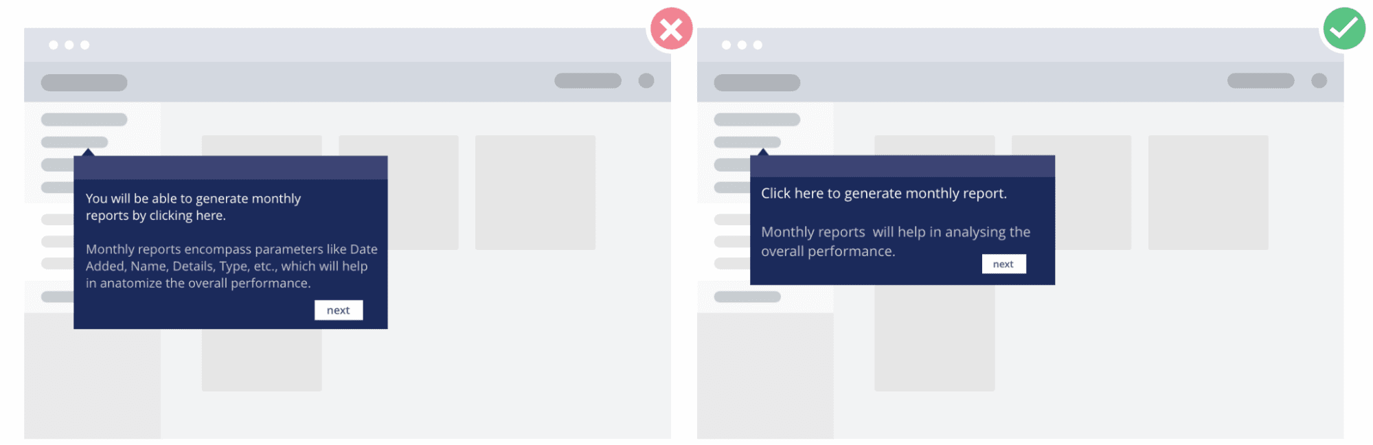
Stick to 1-2 sentences to prevent your tooltip from covering the entire screen. If you need more space, consider including a CTA that leads to a related article or documentation in your knowledge base.
2. Use tooltips to provide additional instruction, not vital information
additional or contextual information on a feature or process. They should not be vital to performing a task.
Let’s look at an example of a product login screen. The requirements for passwords and logins are usually specified right above or below the log-in fields. In this case, using a tooltip might hurt UX as it would require unnecessary action from a user.
3. Don’t be redundant
Not every feature needs an explanation (and if it does, you should probably work on your UI). When a product interface is filled with tooltips, it’s complicated and confusing to navigate. Avoid explaining apparent features or repetitive actions to prevent information overload and redundancy.
4. Be consistent
Keep your tooltips consistent by establishing style and design guidelines that follow a similar format across all your product tooltips.
Creating design guidelines may seem redundant, but it standardizes your tooltips – especially for collaborative, large product teams. Different team members will have different visions of tooltip design. Be sure to establish a format everyone should be following to create a consistent product experience.
5. Use tooltips on mouse and keyboard hover
To activate page elements, users will use the mouse or navigation keys on a keyboard. For better usability, ensure users can control the tooltips’ display with a mouse and a keyboard.
6. Use contrasting colors to make your tooltip stand out
You want your tooltips to stand out from your product interface. A simple way to achieve this is to use contrasting colors to help your tooltip pop. Using the same colors that are already in use in your interface will make your tooltip blend into the background, and users will overlook these messages.
Dive into your brand’s color palette and choose an alternative color that stands out and is consistent with your brand.
7. Keep your tooltips consistent with your product’s design
Tooltip design is no less important than content. Here are a few best practices for designing noticeable but not irritating tooltips:
- Use contrasting colors to make your tooltips stand out
- Use visuals to support your tooltip content when needed
- Follow one theme with all tooltips
- Mind tooltip placement — make sure they don’t hide critical elements or are displayed too far from the elements they describe
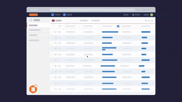
You can see how Whatfix empowers product managers to create custom-branded tooltips in just a few clicks below.
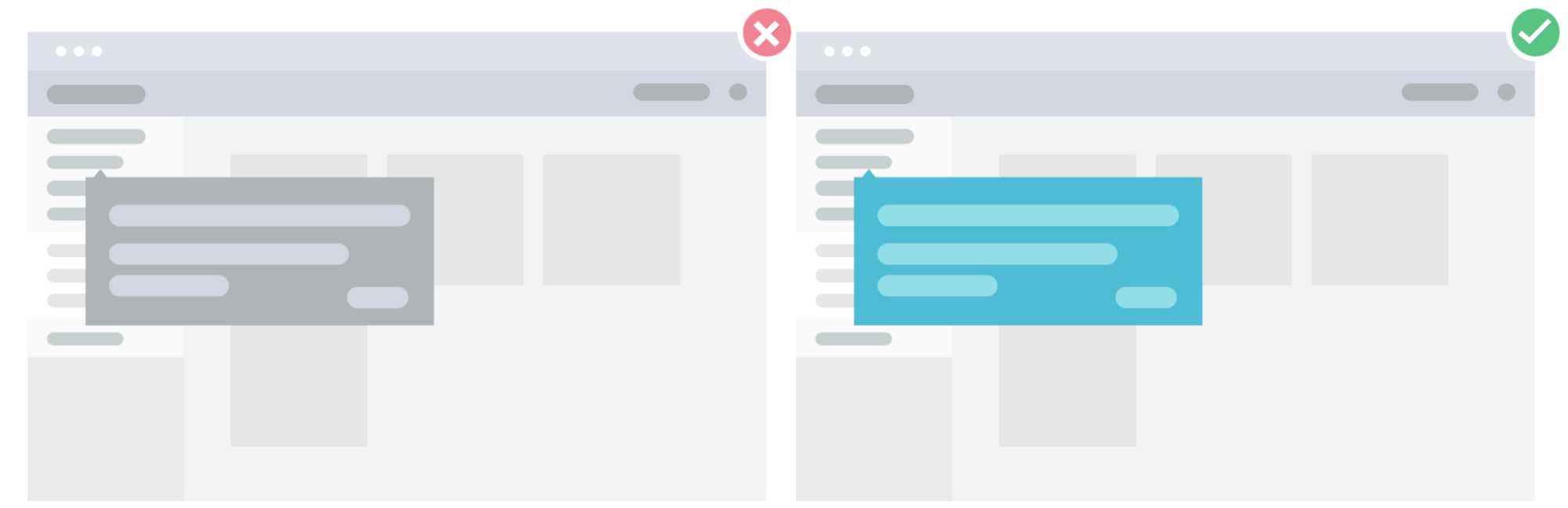
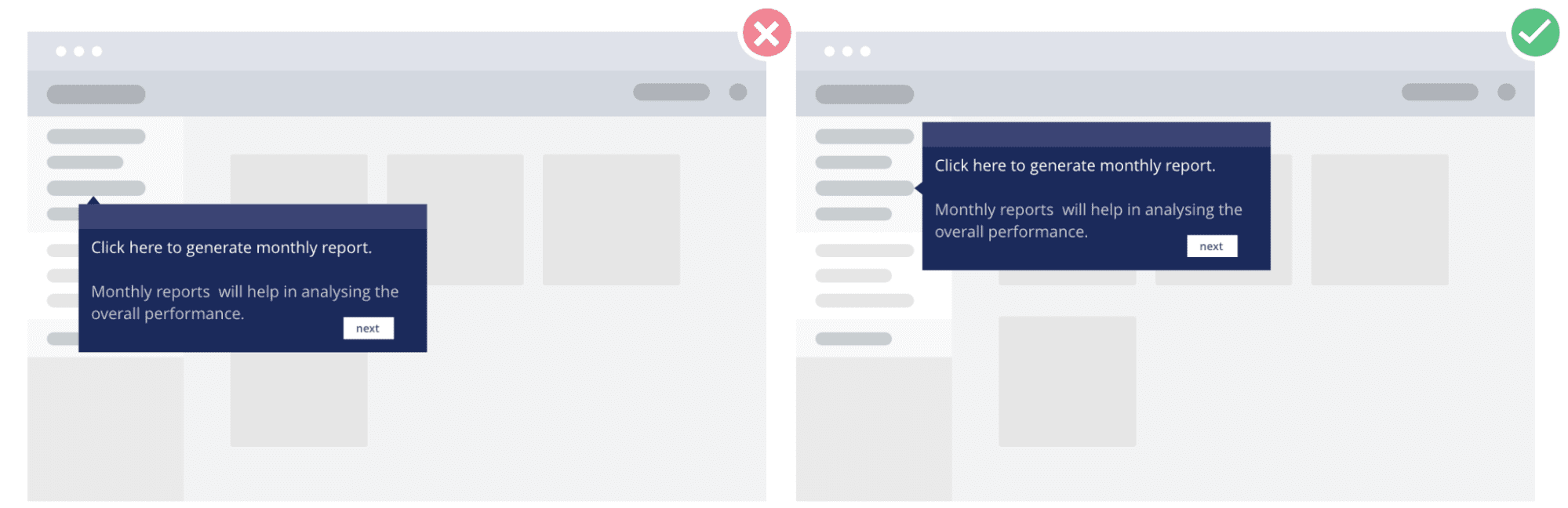
8. Don’t place your tooltips over other elements
The positioning of your tooltips is key to creating a fluid product experience. Be sure to place your tooltips in an area that doesn’t hide critical elements of your UI. Poor placement can inadvertently hide certain UI elements critical to your user flows, ultimately leading to poor adoption.
9. Monitor your tooltips’ performance
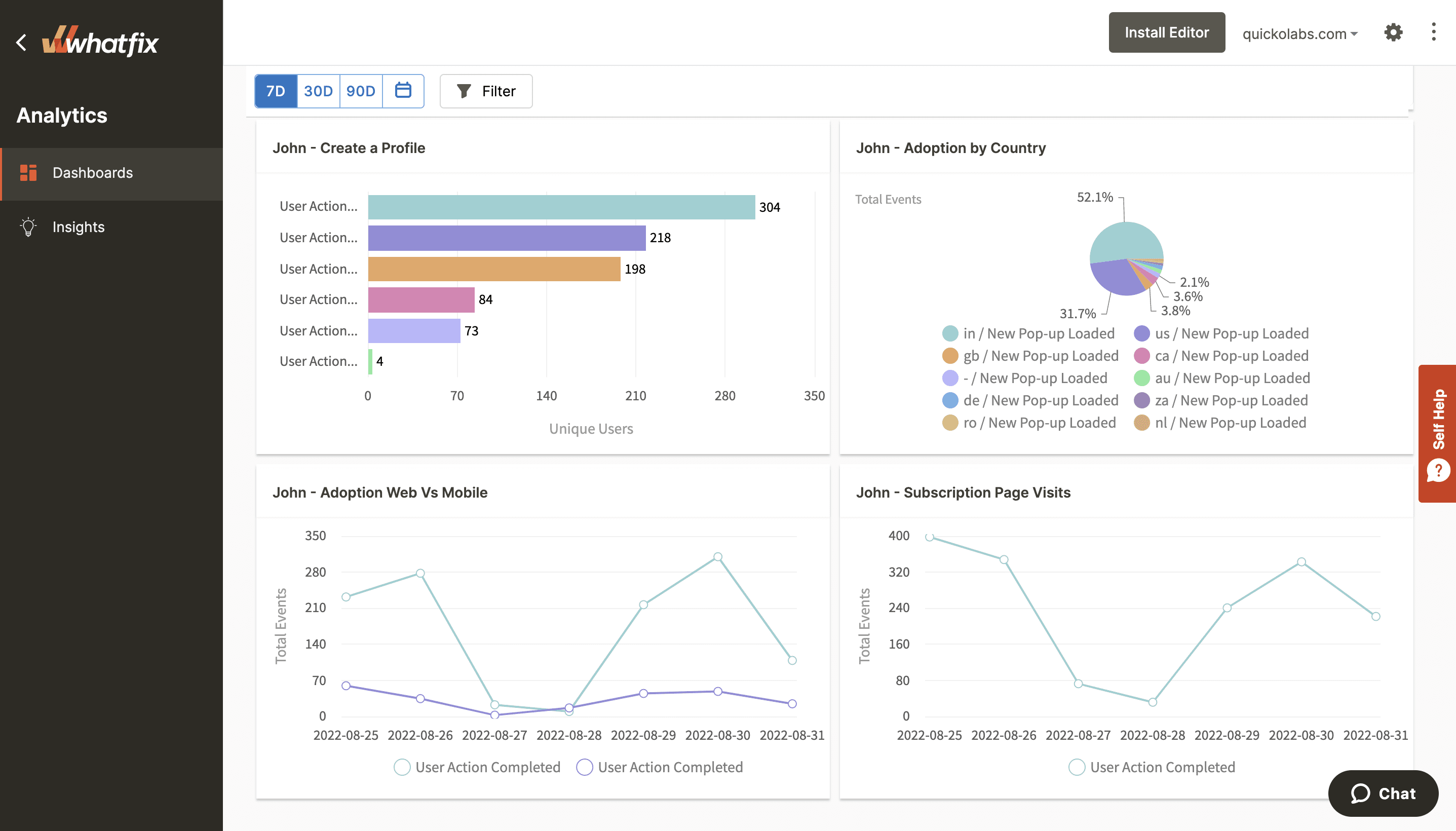
You can continuously improve your tooltips by monitoring how users interact with them. If you create tooltips with a digital adoption platform like Whatfix, the platform will provide you with critical behavioral analytics on the consumption of your tooltips and other in-app guidance. This data provides insights into what you could do to make this in-app content more valuable and where your users struggle.
With Whatfix Analytics, product teams can capture and analyze how users interact and engage with their tooltips and other in-app content.
7 Examples of Great Tooltips
Many SaaS companies implement tooltips to enhance UX. Here are a few great examples of tooltips in action to inspire you.
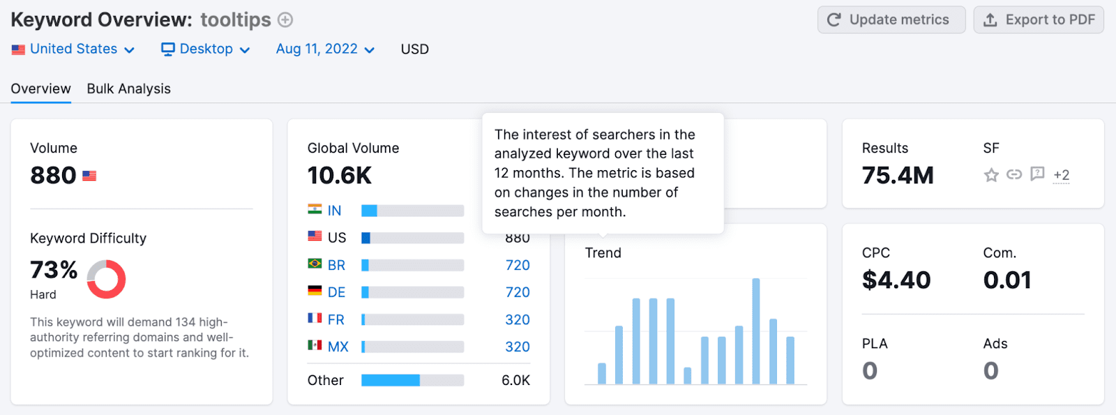
1. SEMrush’s contextual tooltips
SEMrush, an SEO platform, uses contextual tooltips to explain the terminology used within its product interface. Since every SEO tool uses its own terms to describe specific metrics or concepts, SEMrush’s tooltips help to understand the context behind the features offered by the product.
All the contextual tooltips include a maximum of two sentences, briefly explaining the concepts without going too deep.
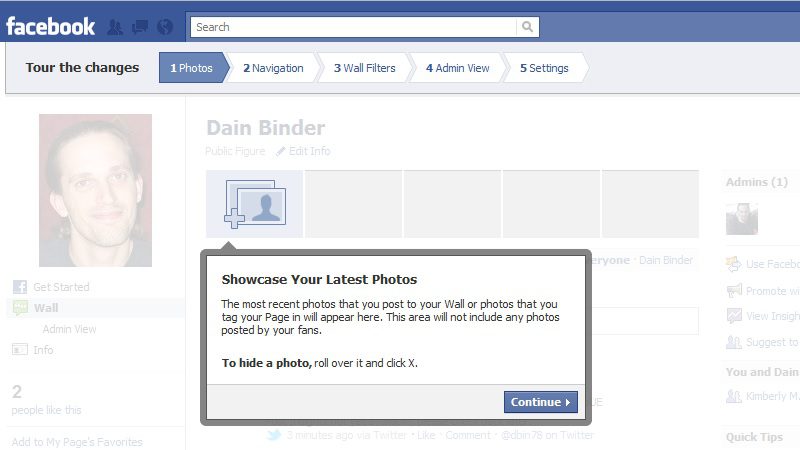
2. HubSpot’s user onboarding
HubSpot creates exceptional onboarding flows for its new users. As one of the most popular SMB marketing automation platforms, HubSpot often attracts customers that have little to no idea about marketing and email automation. The company uses tooltips to guide new customers through their first steps into email marketing and customer relationship management (CRM).
HubSpot’s tooltips implement many UX best practices, including:
- They only display if a user clicks on a hotspot.
- They display a process bar.
- They include CTAs encouraging users to take action and provide a logical next step.
- They include options to close the tooltip window and to stop showing this help content altogether.
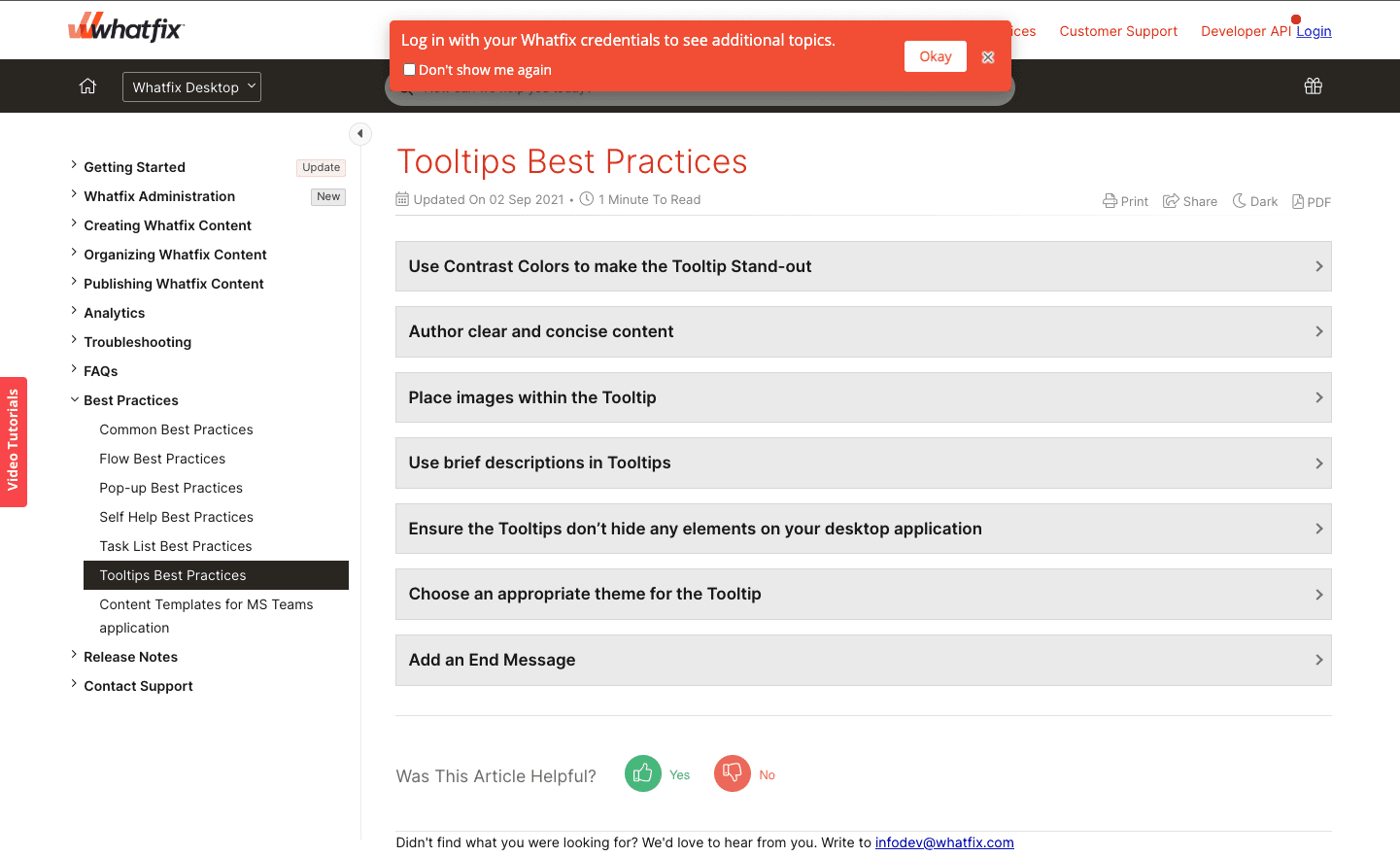
3. Whatfix’s tooltip to login and see gated content
We are a little biased – but we wanted to highlight how we at Whatfix use a tooltip to help nudge our customers and provide a better product experience.
The Whatfix knowledge base is semi-public. Much of our support content is available for anyone to read – but specific documentation is available only to users who are logged in. But how would all of our customers know this?
To address this, we use a tooltip on our knowledge base that only activates for visitors that are not logged in. It alerts these users to log in with their Whatfix credentials to see additional gated documentation and help resources.
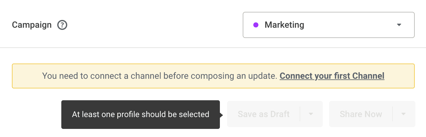
4. Buffer’s warning tooltips
Buffer is a social media management platform. To use Buffer, you must connect your social media accounts to its platform. Before you do this, Buffer blocks actions inside the interface and displays warnings that explain why you can’t take the desired action with tooltips.
This provides contextual support to users who may be frustrated why they can’t begin to use the tool yet. This also provides a logical next step for users to get them set up with the platform and take them one step further in realizing the value of its platform.
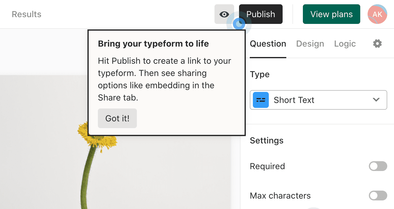
5. Typeform’s process walkthroughs
Typeform’s form builder guides users through in-app processes with guided walkthroughs and tooltips. Users can hover over action buttons when they create their first form to learn what happens at each step.
Tooltips don’t disappear when you move your mouse — you need to click the “got it!” button for it to disappear. This is great for first-time user onboarding, but we recommend against forcing users to complete a task before the model window disappears for typical tooltips.
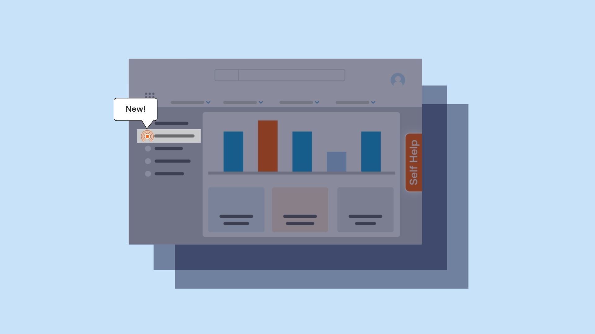
6. Ground News's tooltips that provide additional context on how to navigate it's mobile app features
Ground News is an online news aggregate that differentiates itself from competitors by curating articles from various sources on a single topic or news story and provides a detailed analysis of the political lean or bias for each headline.
Its mobile UI is robust, which means its also busy. To help new users understand how to navigate and use its product, Ground News uses simple pulsing tooltips throughout its interface that provides additional context on how to use its product.
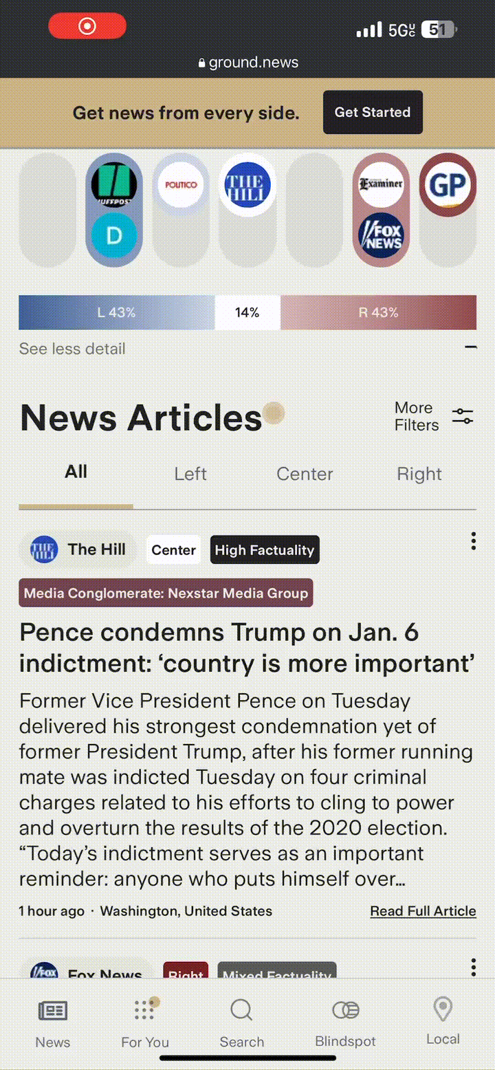
Ground News integrates these tooltips with a pulsating UI element that matches its product’s branding – helping it to feel intuitive to the user experience while also grabbing users’ attention.
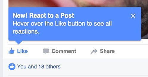
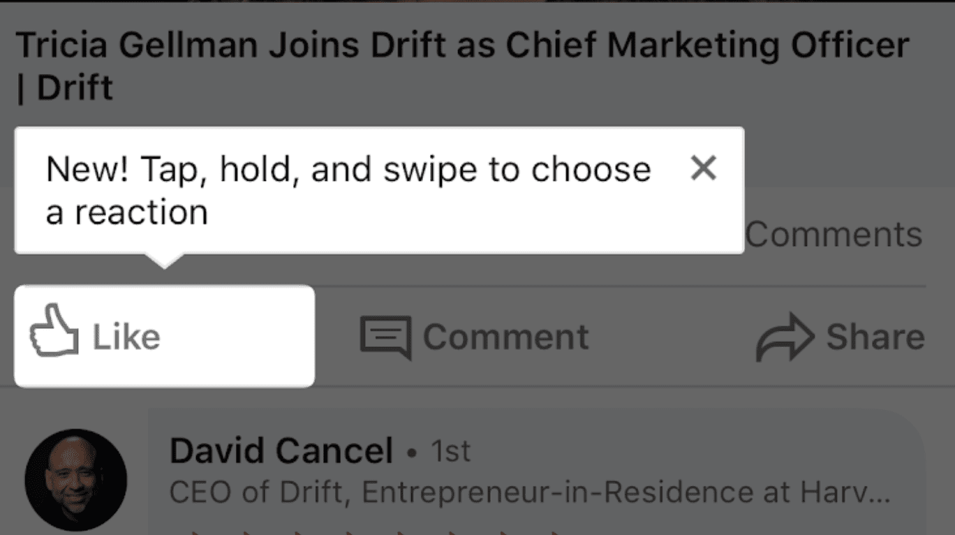
7. LinkedIn’s new feature announcement
LinkedIn doesn’t need an introduction. The company doesn’t roll out new features often, but when they do, they use tooltips to inform users of the changes.
Using tooltips for feature announcements makes it easy to fall into the trap of saying too much, driven by excitement. In this example, LinkedIn isn’t too wordy — it takes nine words to indicate the feature has been recently rolled out and explain how to use it.
Tooltips provide contextual nudges to users for endless use cases. They’re a great addition to any product team’s toolkit if best practices are followed.
And with a DAP like Whatfix, product managers no longer need technical expertise or engineering support to create, deploy, analyze, and test tooltips. With Whatfix, non-technical team members can create and deploy new, custom-branded tooltips within minutes.


Thank you for subscribing!